US Summer Essentials | Skincare Brand, Logo, Packaging
The strategic and visual goal was to communicate the brand's purpose. The choice of fonts, color palettes, and the simplicity of the logo combining the elements of different island backgrounds. US Summer Essentials is all about finding that right balance. I wanted to make sure that the logo would stay classy, without too many colors or designs and yet appealing to the younger crowd. All for one and one for all!
You may also like
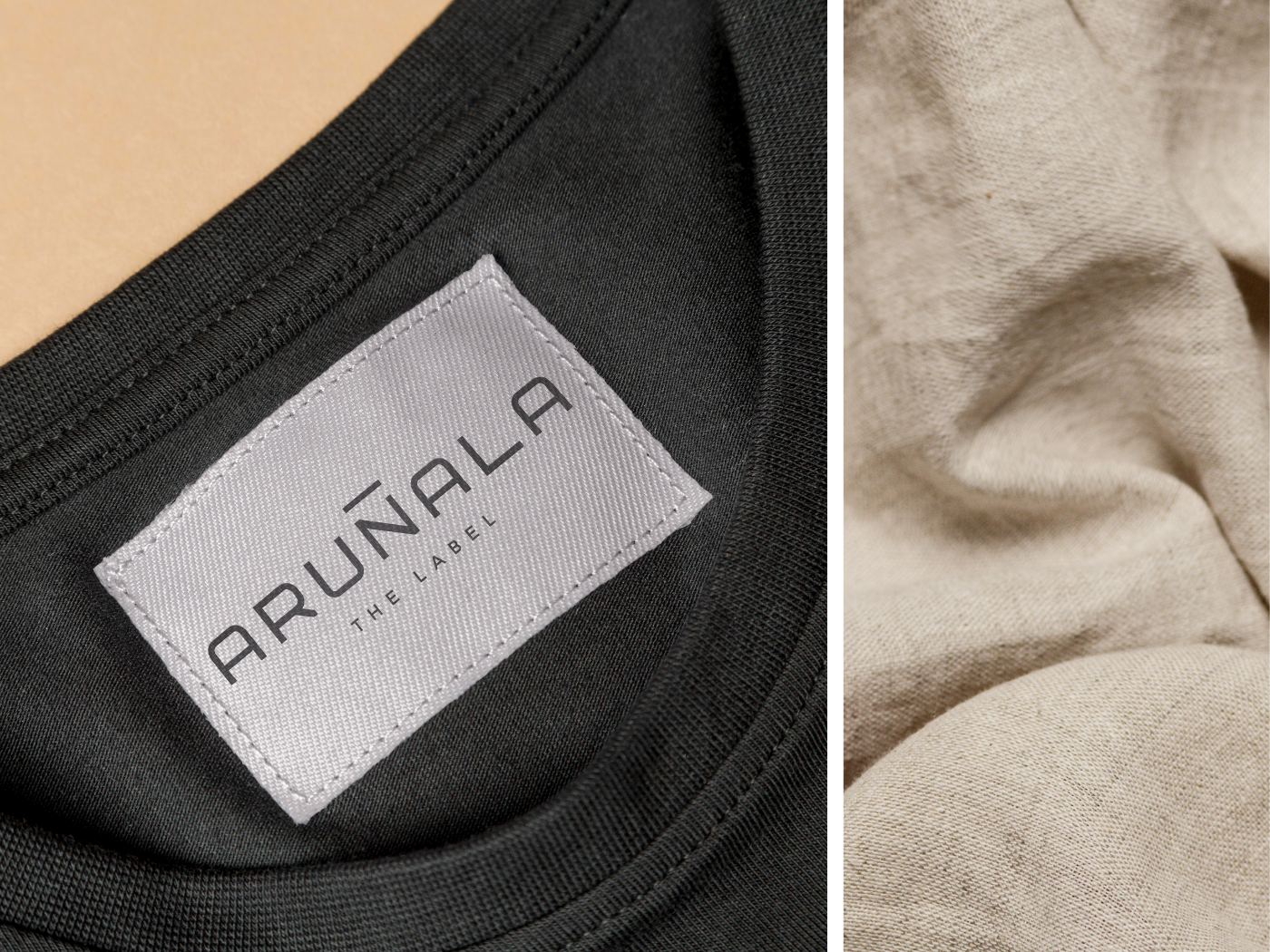
Arunala The Label | Brand Identity, Logo, Packaging
2023
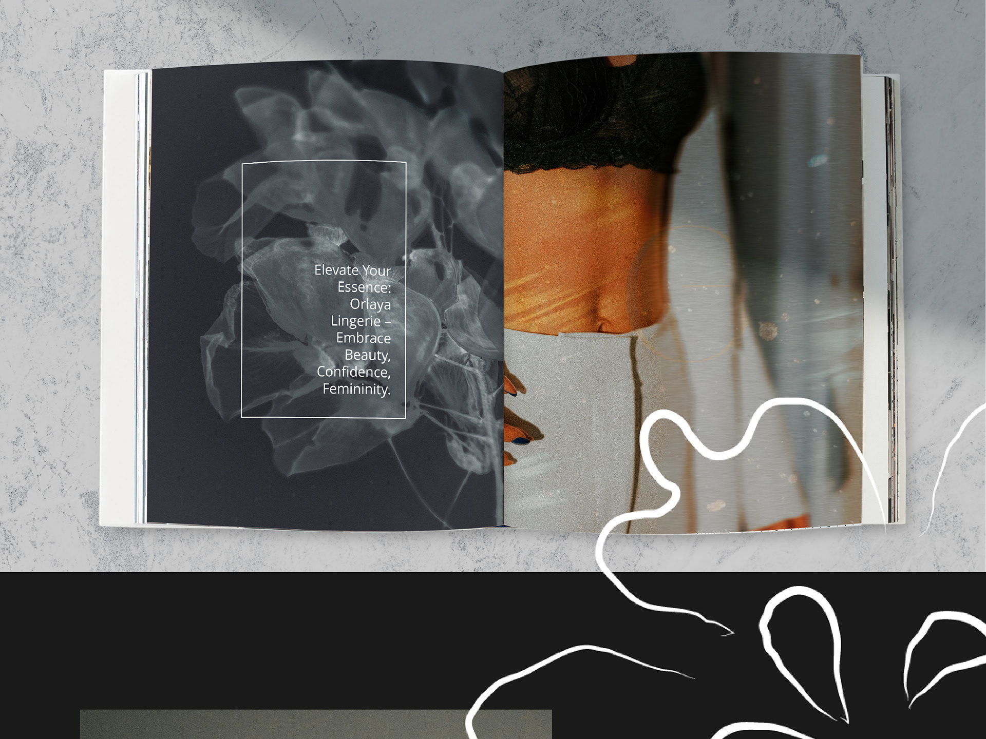
Minimalistic Elegance, Empowered Beauty Branding
2024

Delicate and Luxurious Brand Design
2023
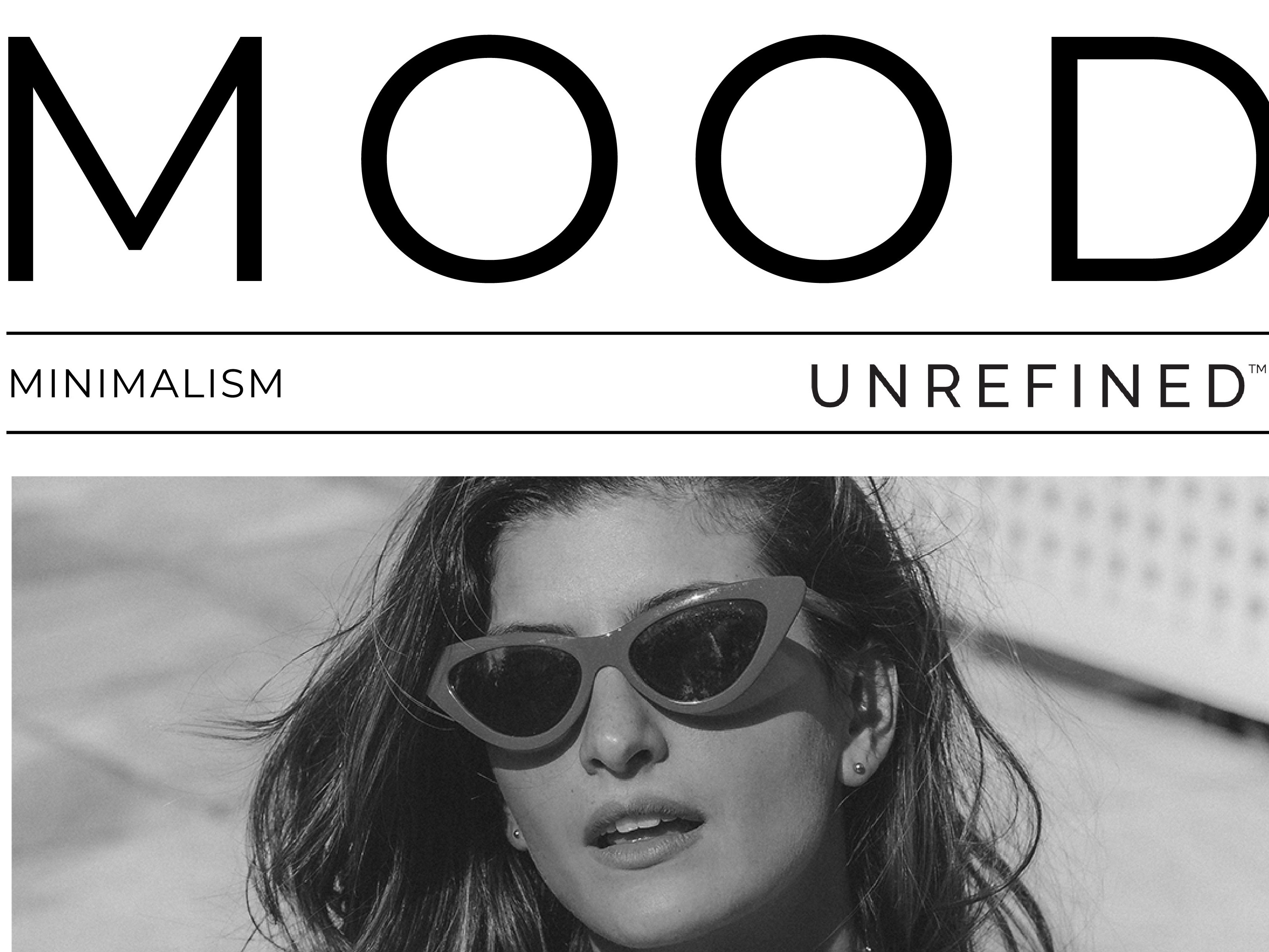
Tropical Minimalism Visual Moodboard
2024
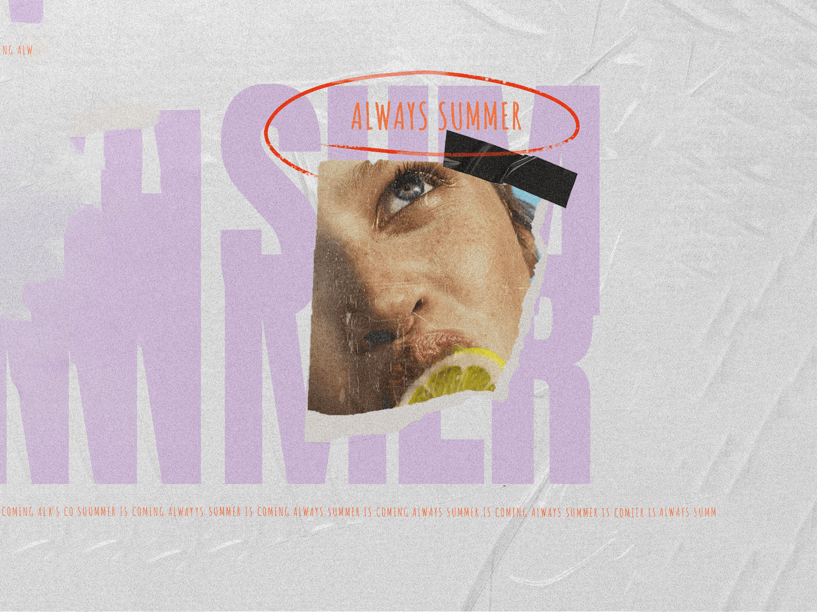
A Vintage Twist on Modern Refreshment
2024
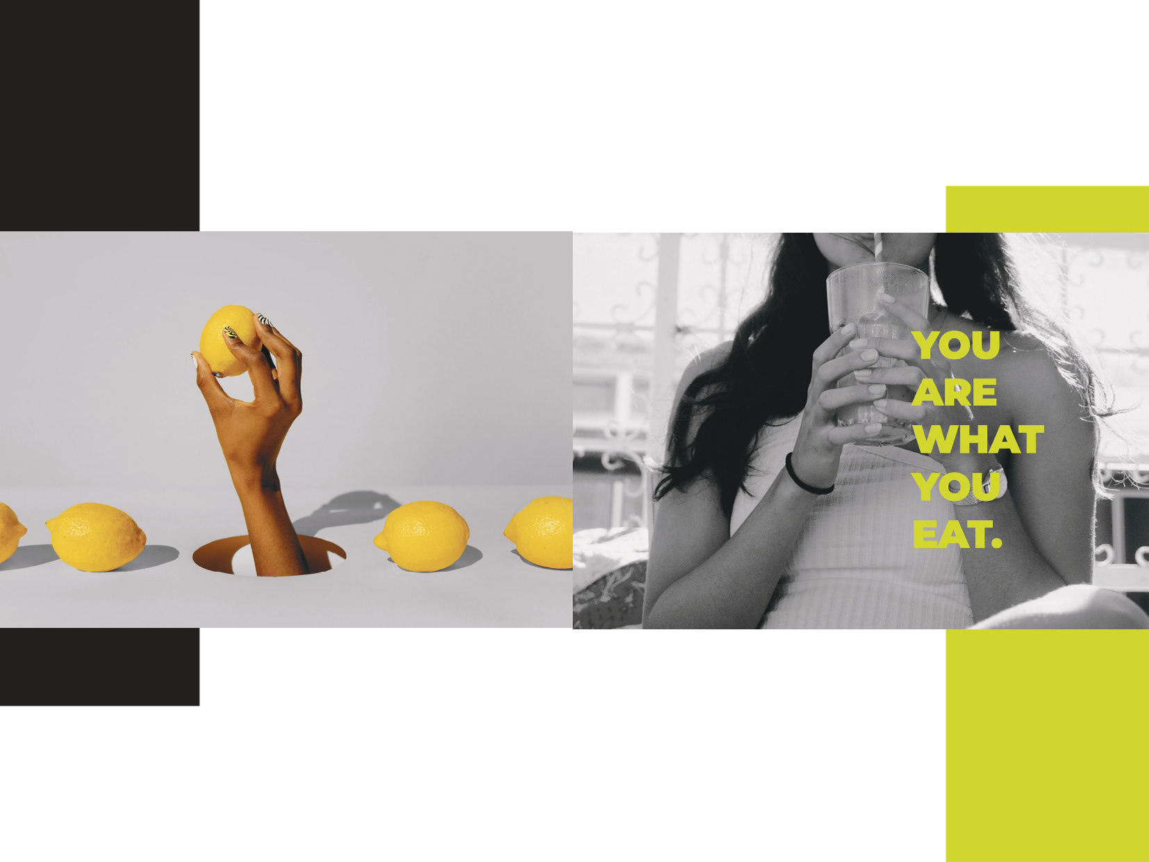
Rype Juice Bar | Brand Guidelines
2023
A Digital Sanctuary for Wellness and Innovation
2024

Personal Branding
2023
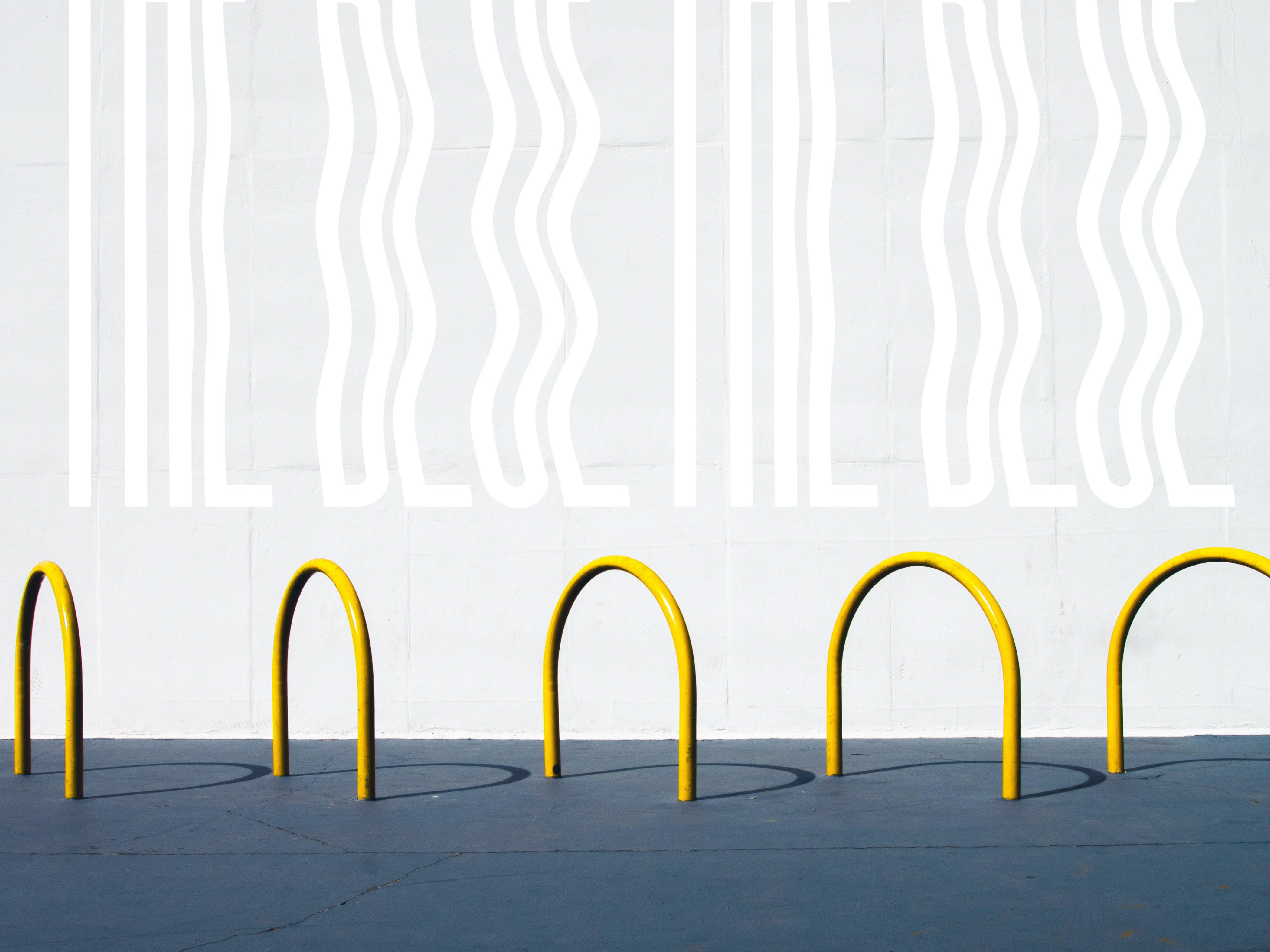
The Color Theory Project - Le Bleu
2024
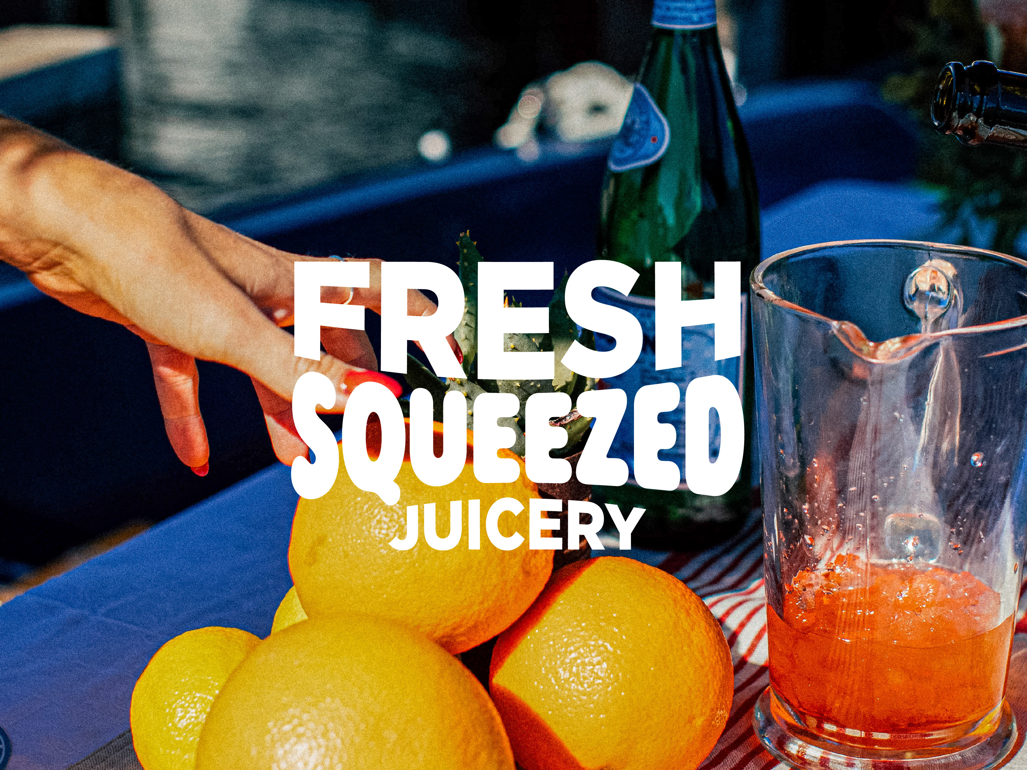
Vintage Vibrant Juice Bar Branding
2023

